Wednesday, January 4, 2012

JACKY Alphabet!!

ALPHABET!!
For this I took pictures from other projects and took pictures on my own and combined them into the alphabet A- is a vent B- is a music thingy C- is a coffee maker D- is a sink handle E- is the bridge F- is a sidewalk G- is a dead bird H- is a window I- is a window frame J- is a road marking K- is part of a bridge L- is a light M- is a cats head N- is the bridge O- is a tree P- is a random thing on the prairie path Q- is a Fire Hydrant R- is flowers and bush S-is siding stuff on a house T- is the top of a hut U- is a flower top V-is a tree W- is a light structure X- is the top of the bridge Y- is the support beam for the bridge Z- is the zig zag feature on the bridge

I really anted to emphasize on contrast so it as easy to detect each of the letter in the alphabet. I also wanted to keep each picture simple and just make each black and white. that also helped with the contrast because B&W really does well demonstrating it. I made a gride to put the pictures in so they looked straight and neat.

Choice Project


I was going for different aspects of my dog. I wanted some "goofy" and some serious pictures of him. The way I would show these qualitities would be by using different angles and lighting. Like in the last picture, I used a higher shutter speed to accomplish a lower lighting effect, I also got really close to his face to get a unique angle of him. A few of these shots have dramatic shadows. I tried to get these shadows to add emotion to the images.


MRS. G!!!! IT' RIGHT HEREEEEEEEEE!!!!!!!!!!!!


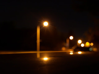
Ok well, I figured out how to use my apature priority setting on my camera. I also figured out how to use my manual focus settings too. This all helped me get this bokeh effect. I would go up to an object and focus on it, so the lights in the background were blurred to get this effect.

Xander Martin's social commentary. better late, than never! soo...


For this social commentary project, I really wanted to target the airline industry. I was hoping to express the fact that they are sucking in money, and not putting much besides a flight from point A to point B... to show in a way that you aren't getting your money's worth. I was hoping my images would portray in some way that the money is being "sucked" in and all that is coming out is no good (smoke). Also the last image was supposed to show the plane flying thru shredded money, kind of like those cartoons of the rich guy diving in to his pool of gold coins. On a artistic level, I spent a lot of time using the croping tool and the lasso tool. I also messed around with the brightnes and contrast levels to make sure the parts of the photograph all looked evenly lighted. For the smoke I basically used the paint tool with a lower opacity, obviously the color I used was black and then for the glowing fire look I used a mix of orange and red.


Studio Lighting - Haley Carmichael

 Butterfly

 Loop

 Remembrant

Split

This project was very interesting as we had to use different lighting techniques. Without the tutorial, I was a little lost and did try to do my best, however these still didn't turn out so great. But I digress! The point of this project was to create contrast and different points of emphasis with different lighting techniques using the flash. All the photos used the same shutter speed though.

Abi's super late staged vignette :)


For my staged vignette I used this Noah's Ark set my mom had in the house. I tried to use alot of different ANGLES and DEPTH OF FIELD. To edit the pictures I used high pass and hard light to make the pictures have much more detail. I also adjusted the BRIGHTNESS and CONTRAST to give it an old day feeling. I tried to make the LIGHTING high above the objects to make it seem like the suns light on the environment of the photo. 

Alpha...bet...Xander


Well, in this project I found that the control "ctr+shift+U" was used a lot, since I desaturated every picture. I also tried to keep a common unique perspective. I did not always just want to get the "obvious" letter, I really tried to find the letter that no one else would find. I also tried to incorporate a lot of textures in the images, just for visual satisfaction. Lighting and shadows were also a big factor in my images.