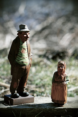
For this project I started off by using
curves to
adjust the
brightness and
contrast. I then
decreased the saturation for most of the pictures and
color burned them to add more of a greenish, brownish or redish
hue. Then for a finishing touch for like two pictures, I added a
vignette.
Hmm...these figure look familiar. Flashback to photo1? Please explain the significance of these figures.Also, more of a story...i feel like these are more posed, but I would like to know why? does that make sense? see me for ?s
ReplyDelete