Wednesday, February 29, 2012

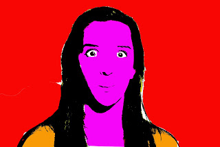
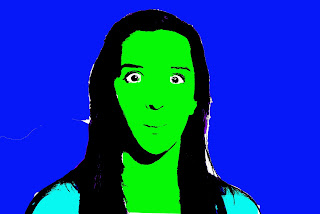
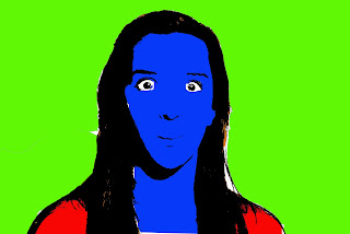
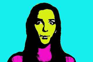
Warhol- Kara


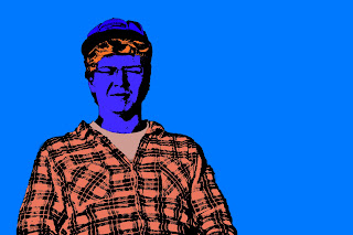
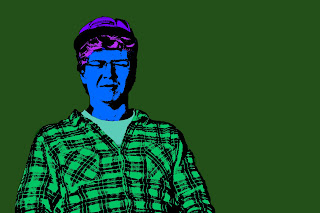
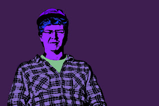
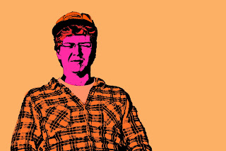
I like how the Warhol project turned out, the four photos are warm cool complementary and choice colors. I had a good amount of trouble with selecting in photoshop and had to go back through with the brush tool and paint over the white spots. To do this project I selected each thing and used the color fill to fill each thing with color. You can see on the complementary photo (orange background) that the selection was not in the right place and the colors are overlapping. In this photo I still used the rule of thirds, and also used contrasting colors.

Jackie Adamle Studio 1 BOKEH


For this project you just shoot light and make it out of focus. I didnt get really creative with it so my bad. With almost all of my photos I made double negatives. I didnt really pay attention to the rule of thirds. With the picture with the ornament I used a very short depth of field. With some of the pictures I adjusted the brightness and contrast.


Day 29 2-29 Leap Day

Day 28 Tues.
Field Trip Forms...collected today.

Critique STUDIO 2 & Up: WEDNESDAY,2-29 that is TODAY
  • Begin Hanging your photos in the hall using WHITE tape
  1. Discuss your series/purpose
  2. Others will comment by...using photo terms (participation grade) while the photographer jots down comments on actual prints.
  • Is the concept being communicated through the image?
  • Aesthetically pleasing?
  • Success/Improvements
  • Which to print in the series (odd numbers work best)
Critique STUDIO 1: THURSDAY, 3-1
  • If you are printing that day, I will deduct points.
  • Print series possibilities for Art Show to the Color LaserJet 5550
  • Letter Size: Tray 1 Manual Feed (Pull it down & Load Paper)
Studio 1: Choice Project Shoot & Begin Alphabet (13 letters) due Monday, March 5

  • 4 Abstract Bokeh due with summary Thursday, March 1
  • Overlap/Double Negs some of these to make it more interesting: See JAllen Example
  • COLOR-make b & w if colors are distracting/busy, then adjust bright/contrast
  • I am giving you a sketchbook break...
Studio 2: Power of Place Shoot due Monday, March 5
  • 4 Staged Vignettes & Summary due Thursday, March 1
  • I am giving you a sketchbook break...
Studio 3: Strobe OR Extreme Close Up Shoot due Monday, March 5
  • 4 Transparency/Projector Overlay due Thursday, March 1
  • I am giving you a sketchbook break...
Studio 4: Megan Shoot due Monday, March 5 what is it???

  • 4 Choice due Thursday, March 1
  • I am not giving you a sketchbook break because I need to see some...
  • I am worried about you.

UPCOMING EVENTS:

ART SHOW DATES: FRIDAY MAY 4 & SATURDAY MAY 5
Last day for prints & mats is Friday, April 27. Note: April 24 & 25 is PSAE testing: no work days.
College Church Art Festival EC
Theme is "Longings"
Register at this site, print it out for me, get work to me by FRIDAY, APRIL 13 (if you don't want to drop it off yourself).

Tuesday, February 28, 2012

(Absent) Warhol!

So, I...strongly disliked...this project.  It was kind of frustrating because there were a lot of steps included. I found the notes hard to follow and since I missed the demo, I was a little confused.  Anywho the first thing I did was increase the brightness/contrast so that the main features were more prominent.  I also adjusted the shadows and highlights.  I made different layers with different selections in each by using the quick selection tool.

Non-traditional new idea (Nina Antonik)

So blogger wouldn't let me post for a couple days.
I already talked to you (Gingerich) about this is what we decided:

I'll take a picture of someone reading a book (example: Little Red Riding Hood) and I'll take a picture/recreation of the scene in the background. Only, when I print these, I'll physically cut the book out and put the real book in it's spot so that you can turn the pages and see the scene in the background (example: wolf and grandma).


Only instead of just what's above, I'll have the picture of the book also, with it cut out.

Caitlyn Van Peenen Studio 1 Bookeh


For my Bookeh project I shot with a very short Depth of Feild. To make my pictures more interesting I cropped them and to add to the composition I made them "Double negs" I layered the pictures and then lowered the opacity on the top layer.


thats imposible!

This firts series of three was taken in downtown alexandra. i used a tripod and a bulb setting to capture a trafic light between green and red, for a signal to look like this is, well, imposible!

This picture captures all the people who are running the yellow in a blured streem of lights.


 This picture is tow seperate pgotographs overlayed to create another imposibility
These ice fishermen are fishing on herick lake, where i went for a hike with my camera, i used the masking tool to put water underneeth them, making it look like they were ice fishing on water!

Claire Trumpy Studio 1-Andy Warhol- late because I was absent


warm


cool


complementary


choice


Alright I'm just gonna be honest I was not a fan of this. I'm not really big in to editing portraits in a weird way, so the only time I would use this technique would be if I was editing landscape pictures. First I had to increase contrast and brightness to show the black in the face. When editing I had to use the quick selection tool and sometimes the lasso tool. I also had to use the threshold tool to give it that certain look. This was not my best work, but whatevvvssss

YAYYYYY!!!!

Mrs.G!!! I got that art scholarship!! YAY!!!!!! $2,500 wootwoot!!! Thanks for helping me figure out my portfolio!!! :D

Nina Antonik - Staged Vignettes


For this project, I had to do a lot of blending and patching. These dolls were a little older and well played with so I had to remove marks and stray hairs that obstructed their faces. One of the main features I edited were the eyes. I changed the hue/saturation to get the color blue I wanted but then I dodged it to make it brighter. The girl with the brown eyes, I just dodged to give her a lighter hazel but above both of the doll's eyes, I burned it slightly to contrast better with the eyes.

Kayla Bass Abstract Bokeh Studio 1


I really enjoyed shooting abstract bokeh. It was fun to be creative with the vibrant colors. In all of my photos I increased the contrast at least a little to add more emphasis to the colors. To shoot bokeh, I used my AV setting to select the lowest aperature value I had. That way, I shot short depth of field to create the effect of a focused forground and an out-of-focus background to make the lights colorful spheres. On one of the candle photos, I wanted to play around with the background lights so I used the smudge tool and distorted the shape.


Ian's Warhol


For the Warhol i ignored the rule of thirds so the focus was only on my sister's dog Chunk. The composition of these pictures are good because the use of color. I used the select tool to select the dog. Then i selected the inverse of that layer and deleted it. I then used threshold. Then I addeed layers of hues.


Warhol

warm
complementary
choice
warm
This project was cool and easy to get used to. I had to use background eraser tool to get a solid backdrop. I also used the threshold tool this made his face more defined. This made it easier to brush tool in the different solid colors. I then used some contrast to bring out the blacks in his shape. It was a fun project and fun/weird to experiment with.
Monday, February 27, 2012

Maddy's Warhol (sp??)


This got a bit confusing because my colors weren't coming out exactly as I chose them. I decided to switch it up a bit with my filter/ layer on my background layer a bit and made it a linear or hard light to give it a vignette effect. I like this project because of the contrast, but it is also something that I would like to continue working with until I really like it. But I also like how the composition turned out. So yeah! I enjoyed this and I like the technique!
The Order: Choice, Complementary, Cool, Warm.
(the only thing I don't like is that I kind of look like the joker in some of them.....)

Mary Sketchbook

So this is it so far...I drew out the skyline in pencil and Im planning on painting it black LAST. The big mess of bold headlines on top is the smoke.  The only thing I am having trouble with is getting the air bubbles out after I use the decoupage.  So yeah that is it!

Day 28 Tues.

Field Trip Forms...will be collected when I return.

TAs Paul Giacalone & or Nina Antonik:
  • Please refill and mix all FILM chemicals.
  • Also, turn the big 2 gallon containers around so we do not see the labels.
  • Photo 1 is having a Quiz today and chemical sequence is one of the questions.
  • (period 4 is the 1st photo 1 class)
  • Organize Back counter of Photo 1 room
  • Organize Garage table area
Critique STUDIO 2 & Up: WEDNESDAY,2-29 that is tomorrow.
  • If you are printing that day, I will deduct points.
  • Print series possibilities for Art Show to the Color LaserJet 5550
  • Letter Size: Tray 1 Manual Feed (Pull it down & Load Paper)
Critique STUDIO 1: THURSDAY, 3-1
  • If you are printing that day, I will deduct points.
  • Print series possibilities for Art Show to the Color LaserJet 5550
  • Letter Size: Tray 1 Manual Feed (Pull it down & Load Paper)

 Studio 1: Choice Project Shoot & Begin Alphabet (13 letters) due Monday, March 5
  • 4 Abstract Bokeh due with summary Thursday, March 1
  • Overlap/Double Negs some of these to make it more interesting: See JAllen Example
  • I am giving you a sketchbook break...
Studio 2: Power of Place Shoot due Monday, March 5
  • 4 Staged Vignettes & Summary due Thursday, March 1
  • I am giving you a sketchbook break...
Studio 3: Strobe OR Extreme Close Up Shoot due Monday, March 5
  • 4 Transparency/Projector Overlay due Thursday, March 1
  • I am giving you a sketchbook break...
Studio 4: Megan Shoot due Monday, March 5 what is it???
  • 4 Choice due Thursday, March 1
  • I am not giving you a sketchbook break because I need to see some...
  • I am worried about you.
Comment to this post for 5 pts. extra for being a good photo student...you rock.
UPCOMING EVENTS:

ART SHOW DATES: FRIDAY MAY 4 & SATURDAY MAY 5
Last day for prints & mats is Friday, April 27. Note: April 24 & 25 is PSAE testing: no work days.
 
College Church Art Festival EC
Theme is "Longings"
Register at this site, print it out for me, get work to me by FRIDAY, APRIL 13 (if you don't want to drop it off yourself).

­­

Sketchbook


Another small project I did to show my theme of seasons, I am doing the polaroid project I originally wanted to do. I am using the wire and polaroid pictures to show the progression of tree's over the seasons. I bent the wire to say "breathe" because tree's give us oxygen for us to breathe. I also tied hemp around my wire to hold it into place.

sketchbook

you can't really tell but I have half of it done which is what you told me to do sooooooooooooo yea.


go photo.