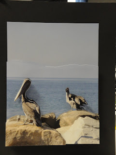


The spatial is one of my favorite projects. Definitely hanging it up in my room. I chose a beachy scene and it really wasn't hard to do. This image follows the rule of thirds because the pelicans aren't directly centered. The contrast in the rocks allowed the layers to stand out more. The five layers allow there to be depth and to see the image differently. They also allow the viewer to notice more of the details in the image such as the rocks and faint mountains in the background. This image has a short depth of field which makes the pelicans most clear and the main subject.
Sulma, why so late- due Fri? Your pix need to be shot better. The computer lab is not the best background. Remember, these are to be put in your final portfolio...
ReplyDelete