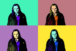
I enjoyed the warhol activity but it felt really repeitive doing it four times. First, I adjusted the shadows and highlights to make there more of each. That way, when I used threshold, you could clearly see the highlights as white and the shadows as black. Also, I desaturated the photo to make it B&W. My choice warhol looks similar to the complimentary one because I had purple and yellow also in that one because I liked how they contrasted. Lastly, I put all of them in one picture like a grid to easliy see them all but I have them saved seperately to put them into my portfolio folder later. :}
No comments:
Post a Comment